Kitchen and Wardrobe Design Mistakes That Make a New Home Look Dated in Three Years
Most people assume a kitchen gets replaced because it stops working. The data says otherwise. In the 2026 U.S. Houzz Kitchen Trends Study, published in January 2026 from a sample of 1,780 homeowners, 41 percent of renovating homeowners said dissatisfaction with their old kitchen's style drove the project, ahead of the 38 percent who cited deterioration or dysfunction.
In other words, more kitchens are torn out for looking wrong than for being broken. That is a design problem, not a manufacturing one.
What are the most common kitchen and wardrobe design mistakes?
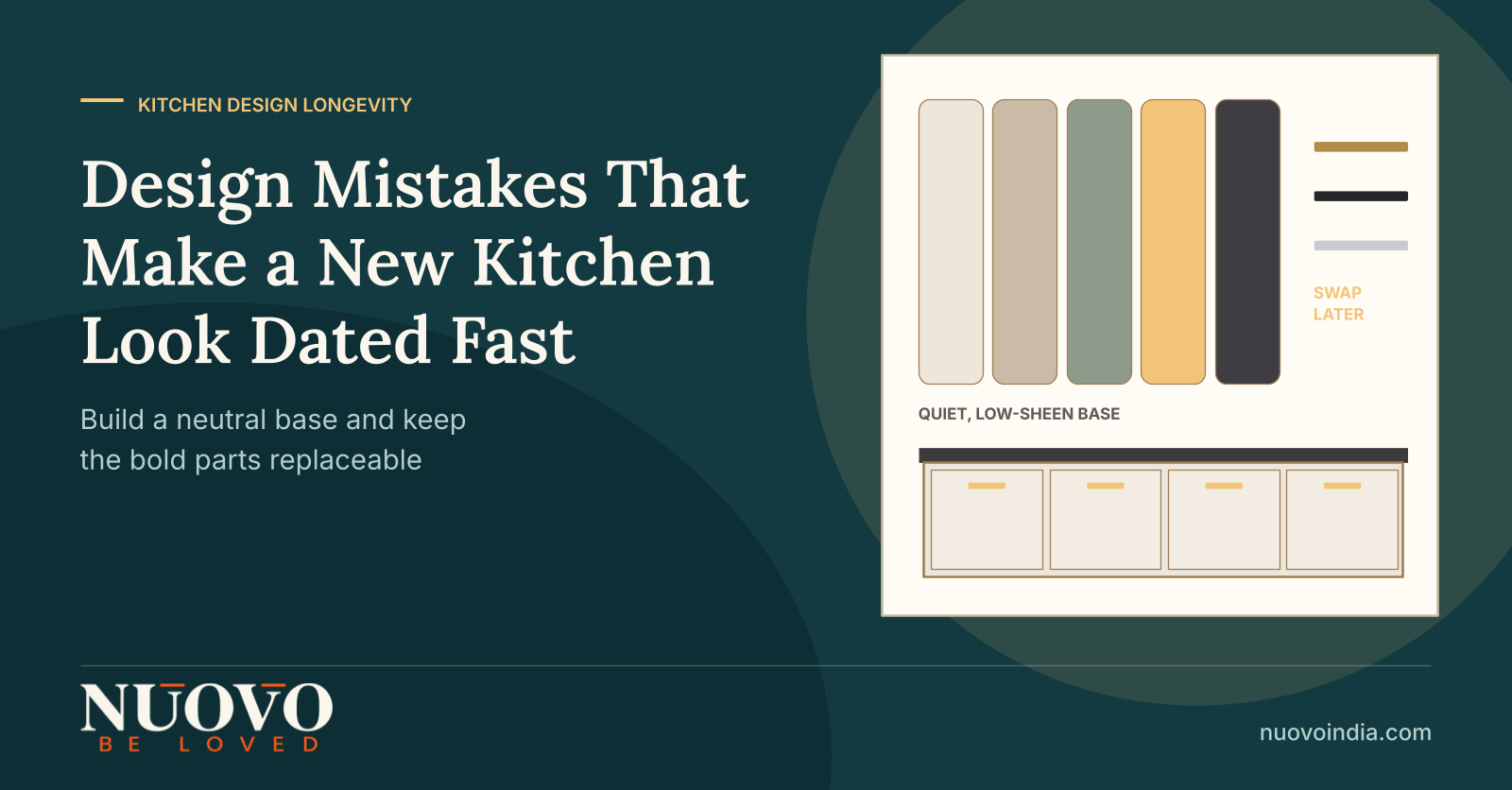
The design mistakes that age a kitchen or wardrobe fastest are rarely structural. They are choices that chase a current look: high gloss on every shutter, one fashionable neutral drenched across the whole room, handle profiles and edge details tied to a single season, open shelving inside a cooking zone, and wardrobe fronts styled for a photograph rather than a daily routine. These decisions look confident on a render and tired within a few years, because surfaces wear unevenly, colour reads differently in Indian daylight, and the detail dates while the carcass is still sound. The fix is a neutral base with expressive elements kept replaceable.
What does aesthetic longevity actually mean here?
Aesthetic longevity is the number of years a design keeps looking intentional, rather than the number of years the material survives. A shutter can be perfectly sound at year six and still make the room feel like a dated showroom.
Two terms are worth separating before any design discussion. Carcass refers to the boxes that carry load and hold alignment, usually in plywood or a board such as medium-density fibreboard. Shutter and surface refers to everything you see and touch: fronts, countertop, edge bands, handles and backsplash.
Longevity planning treats these as two different lifespans. The carcass should be specified for 15 years or more of silent service, while the visible layer should be specified so that it can be refreshed without dismantling the cabinetry behind it.
What does getting the design wrong actually cost?
It costs the whole visible layer, because surface choices are the hardest part of a kitchen to change in isolation. Once shutters, counters and backsplash are committed as a single styled package, replacing one element makes the rest look mismatched.
- Style churn is fast and measurable. The 2026 Houzz study recorded wood cabinet fronts at 29 percent, up six points in a single year, while white fell five points to 28 percent. A finish that felt like the safe default in 2025 lost share within twelve months.
- Countertop fashion moves too. Engineered quartz dropped seven points to 32 percent between the 2025 and 2026 Houzz studies, and granite fell four points to 15 percent.
- Rework is not cheap. The same Houzz study put the median spend on a major kitchen remodel at USD 55,000 in the United States, which is a useful signal of relative cost even though Indian pricing differs substantially.
- The rebuild cycle is also a tax cycle. Modular kitchen and wardrobe furniture in India attracts GST at the standard furniture rate, so every avoidable redo carries tax on the full new scope, not just the part that failed.
None of this argues for a timid design. It argues for putting the risk in the cheap, swappable layer instead of the expensive, embedded one.
Why do kitchens and wardrobes look dated faster than they used to?
Because the design reference pool is now global and refreshes continuously, while the installation is fixed for a decade. A homeowner briefs from images that are months old, and the industry has already moved by handover.
The professional consensus has shifted towards restraint as a result. In the NKBA and KBIS 2026 Kitchen Trends Report, released in September 2025 from 634 industry respondents, transitional or timeless design led at 72 percent, ahead of contemporary, modern and minimal design at 60 percent.
That same 2026 NKBA report put flat slab cabinet doors at 69 percent and wood grain fronts at 59 percent, with white oak the most requested wood type at 51 percent and neutrals named by 96 percent of respondents. Read together, the signal is a quiet base with warmth, not a statement surface everywhere.
There is also a market reason the stakes are rising. IMARC Group valued India's modular kitchen market at USD 3.79 billion in 2026 and projects USD 4.86 billion by 2034 at a 3.16 percent CAGR, which means more homeowners buying a category they have never bought before, from a wider field of suppliers.
Which design mistakes age the worst?
The worst offenders are the ones applied uniformly across every surface, because uniformity removes the option of a partial refresh. Below are the patterns that reliably look wrong first in Indian homes.
Is a full gloss kitchen a mistake?
Full gloss is the single most common longevity mistake, for two separate reasons. It shows every fingerprint and swirl mark in bright daylight, and it carries a strong period signature that dates the whole room at once.
"Highly lacquered, glossy kitchens are beginning to feel overdone."
Sophie Pringle, Founder, Pringle & Pringle, speaking to Homes & Gardens for its 2026 kitchen trends feature.
A more durable approach is gloss used as an accent on a tall unit or an island front, with matte or soft-touch surfaces on the working runs. The look survives, the maintenance burden drops.
Why does one single neutral across the whole kitchen backfire?
Because a single-tone scheme has no material contrast to fall back on when the tone goes out of fashion. Every surface dates on the same day.
Contrast also does practical work. A different tone or material on the island, tall unit or backsplash hides wear patterns, breaks up long runs visually, and lets you change one zone later without touching the rest.
Is imported styling a problem in an Indian apartment?
It is a problem when the styling is transplanted without adjusting for the architecture it is going into. Ceiling heights, window positions, daylight quality and door swings in an Indian apartment rarely match the reference image.
"While we love this European influence, if it does not fit the overall architecture, it can feel too forced."
Sadie Beachy, Principal and Creative Designer, S.Flynn Design + Build, quoted by Homes & Gardens in its 2026 kitchen trends feature.
What about open shelving and fully handleless fronts?
Open shelving inside a cooking zone is a maintenance mistake before it is an aesthetic one, because cooking oil film settles on everything stored in the open. In an Indian kitchen with daily tempering and frying, that film becomes visible within weeks.
Fully handleless fronts look clean on day one and depend entirely on the push mechanism or the finger groove holding up. If the groove edge is poorly banded or the mechanism is mismatched to shutter weight, the detail reads as a failure rather than a style.
Which wardrobe design mistakes show up fastest?
Wardrobe mistakes are almost always about proportion rather than finish. A front styled for symmetry, with internals divided to match that symmetry, produces sections that no real wardrobe load fits into.
- Shutter-led internal division, where the inside is split to match the outside rather than to match hanging lengths, folded stacks and luggage.
- Reduced depth to gain floor space, which makes a hanging section unusable because a hanger needs its full swing.
- Too many small compartments, which look organised in a drawing and force daily double-handling in use.
- Mirror and glass placement decided on elevation, then found to sit where a door swing or a light source makes it unusable.
Glossy, matte or veneer: which finish holds its look longest?
Matte and textured finishes hold their appearance longest in Indian conditions, while high gloss demands the most upkeep and dates the fastest. The table below compares the finishes most often shortlisted for shutters.
|
Finish |
Shows marks |
Upkeep effort |
Style durability |
Best used as
|
|---|---|---|---|---|
|
High gloss acrylic or lacquer |
High, fingerprints and swirl marks visible in daylight |
High, needs frequent soft-cloth cleaning |
Low, strong period signature |
Accent on a tall unit or island, not full runs |
|
Matte laminate |
Low |
Low |
High, reads as neutral base |
Working runs and base units |
|
Textured or wood-grain laminate |
Low, texture disguises light scuffing |
Low |
High, aligns with the current move to wood tones |
Large visible surfaces and wardrobe fronts |
|
Natural veneer |
Medium, marks on a damaged topcoat are hard to spot-repair |
Medium |
High if the tone is kept natural |
Feature zones away from wet and heat areas |
|
Soft-touch or matte PU |
Low to medium |
Medium |
Medium to high |
Shutters where a seamless, low-sheen look matters |
Two caveats matter more than the finish name. Edge banding quality decides how a shutter ages at the corners you touch every day, and the same finish name from two suppliers can perform very differently depending on the substrate behind it.
How should you judge a design, if looking good is not enough?
Judge it on whether it will still be usable and current when the honeymoon ends. Five criteria separate a design that lasts from one that photographs well.
- Base and accent are separated. The design should name which surfaces are the long-life neutral base and which are the deliberately replaceable accents. If every surface is a statement, nothing can be refreshed.
- Storage is planned from a real inventory. Sections should be sized from an actual list of what goes in them, including the awkward items: pressure cookers, large thalis, mixer jars, suitcases, winter bedding.
- Movement is checked before aesthetics. Zones for prep, cook and clean should be resolved against the kitchen work triangle and real door and drawer swings, not just drawn in plan.
- Materials and hardware are specified by name, grade and model. Board type, core, thickness, finish, edge banding and hardware model should be written down, because a drawing without a specification is a hope.
- Design and execution answer to one party. Longevity usually fails at handoffs, where a detail is redrawn on site by someone who did not design it.
What should you check before you sign off on a design?
Check the things that are expensive to change later and cheap to verify now. Run through these six before approval.
- Ask which elements can be changed in year seven without touching the carcass. A good answer names specific swappable items. A vague answer means the whole visible layer is locked together.
- See the finish as a large sample, in your own light. A 50 mm chip under showroom lighting tells you almost nothing about how a surface reads across a three metre run in your kitchen's daylight.
- Get the full material and hardware specification in writing. Every board, finish, edge band, hinge, channel and lift mechanism should appear with its grade or model number.
- Walk your own routine through the plan. Trace groceries from the door to storage, and a full cooking cycle from prep to serving to cleaning, and mark every place you cross your own path.
- Measure reach and height against the people who use it. Counter height, loft height and wall-unit depth should be set from the primary users' measurements, which is basic ergonomics and not a premium feature.
- Confirm who owns site coordination and installation. Ask who measures, who makes, who installs, and who returns if a shutter drops out of alignment in month four.
If a prospective partner can answer all six without hedging, you are dealing with a planning process rather than a catalogue.
Working with a design-to-execution partner
This is the discipline Nuovo Kitchens & Wardrobes is built around: modular kitchens and wardrobes for residential projects where design thinking, storage planning, material and hardware selection, manufacturing and installation are handled as one accountable process rather than separate handoffs. Nuovo works with homeowners as well as architects and interior designers, on new homes, renovations, apartments and villas.
The practical benefit of that structure is that longevity decisions, the ones about base versus accent, specification and proportion, get made at design stage and survive into what is actually built. The modular kitchen and wardrobe projects shown on nuovoindia.com are the output of that sequence.
If you are weighing finishes, layouts or storage against how long the result needs to last, it is worth having that conversation before anything is frozen. You can look through Nuovo's design-to-execution approach or discuss your kitchen or wardrobe requirements with the Nuovo team.
Frequently asked questions
How long should a modular kitchen look current before it needs updating?
A well planned kitchen should look intentional for ten years or more, with one refresh of the visible accent layer somewhere in that period. If the design is built around a single trend-driven finish applied everywhere, expect it to start feeling dated in three to five years. Separating a neutral base from replaceable accents is what buys the longer window.
Is matte always a better choice than gloss in an Indian kitchen?
Matte is the safer default for large working surfaces because it hides fingerprints, water spotting and light scuffing far better in bright daylight. Gloss still has a place as a controlled accent, on a tall unit or an island front, where it adds depth without covering the whole room. The mistake is uniform gloss, not gloss itself.
What is the most common wardrobe design mistake?
Dividing the inside to match the outside. When internal sections are set by shutter widths rather than by what is actually being stored, you get compartments that are too narrow for folded stacks and too shallow for hanging. Plan the internals from a written inventory first, then design the fronts around them.
Should I avoid dark or bold colours to keep the design timeless?
No, but keep them in the layer you can change. A bold island, a single tall unit or a backsplash can carry colour without locking the whole kitchen into one season. Spreading the same bold tone across every surface is what makes a refresh a full replacement.
Does better hardware actually affect how a design ages?
Yes, because almost everything a user perceives as a design failing is a hardware or alignment failing. A sagging shutter, a drawer that no longer closes flush, or a lift mechanism that has lost its hold makes a good design look cheap. Specify hardware by brand and model, and confirm that installation and after-sales support are part of the scope.
Is it worth paying for a detailed design stage if the layout seems obvious?
Usually yes, because the obvious layout is the one that ignores your specific appliances, door swings and storage inventory. A proper design stage surfaces those conflicts on paper, where changing them costs a revision rather than a rebuild. It is also the only point at which base versus accent decisions can still be made cleanly.
Sources
- 2026 U.S. Houzz Kitchen Trends Study, Houzz, January 2026.
- The Houzz 2026 Kitchen Design Trends Report: What's Hot and What's Not, Forbes, 13 January 2026.
- NKBA | KBIS Releases Annual 2026 Kitchen Trends Report, National Kitchen & Bath Association, September 2025.
- India Modular Kitchen Market Report, Size and Outlook, IMARC Group, 2026.
- The Kitchen Trends Designers Say Already Feel Overdone in 2026, Homes & Gardens, 2026.
-
How good quality furniture can improve overall efficiency

-
Increase productivity with use of good quality office furniture.

-
Your Comfort is our first priority.

-
Benefits of modular kitchen

-
Advantages of Modular Kitchens over traditional Kitchens

-
10 Tips for Planning the Perfect Modular Kitchen

-
How to Choose the Right Office Chair for Your Needs

-
How to Care for and Maintain Your Modular Kitchen

-
The Role of Color in Office Furniture

-
How do you set a table for dinner?

-
Kitchen Pricing Breakdown

-
How to Verify a Kitchen or Wardrobe Company's Real Work Before You Pay an Advance

-
Modular vs Carpenter Made Kitchens: Which Common Beliefs Actually Hold Up in 2026?

-
How Families Can Agree on a Kitchen or Wardrobe Without Months of Back and Forth
-
Kitchen Pricing Myths That Quietly Cost Indian Homeowners Money

-
Kitchen Workflow Myths: Why a New Kitchen Can Still Feel Tiring to Cook In
-
Kitchen and Wardrobe Design Myths That Quietly Date Your Home

-
Hardware Myths That Quietly Shorten the Life of Indian Kitchens and Wardrobes

-
Kitchen Execution Myths: Why Projects Stall After the Design Is Approved
-
7 Vendor Myths That Decide Whether Your Modular Kitchen Turns Out Well
-
Kitchen Maintenance Myths: What Really Keeps an Indian Kitchen Easy to Clean

-
Kitchen Ergonomics Myths That Quietly Make Indian Kitchens Exhausting To Use

-
Kitchen and Wardrobe Timeline Myths: What Actually Decides When Your Project Finishes

-
Why Families Stall on Kitchen and Wardrobe Decisions, and What Actually Works

-
Kitchen and Wardrobe Mistake Myths: What Really Causes Regret in Indian Homes

-
Why Beautiful Kitchens Stop Working: The Practicality Myths Worth Questioning Before You Build

-
How to Plan a Kitchen Layout Around the Way Your Family Actually Cooks
-
Why Kitchen and Wardrobe Budgets Overrun, and How to Lock Yours Before Work Starts

-
The Material Mistakes That Decide Whether Your Kitchen Lasts Five Years or Fifteen

-
Drawers, Shelves or Tall Units: Which Kitchen Storage Actually Earns Its Space?

-
Why Kitchen and Wardrobe Hardware Fails Early, and How to Specify Hardware That Lasts

-
The Kitchen Workflow Mistakes You Can Still Fix on the Drawing

-
Wardrobe Mistakes That Quietly Cost You Storage, and How to Plan Around Them

-
The Storage Mistakes That Make Brand New Kitchens And Wardrobes Feel Small

-
What Your Modular Kitchen Quote Does Not Include, And How to Find Out Before You Sign